
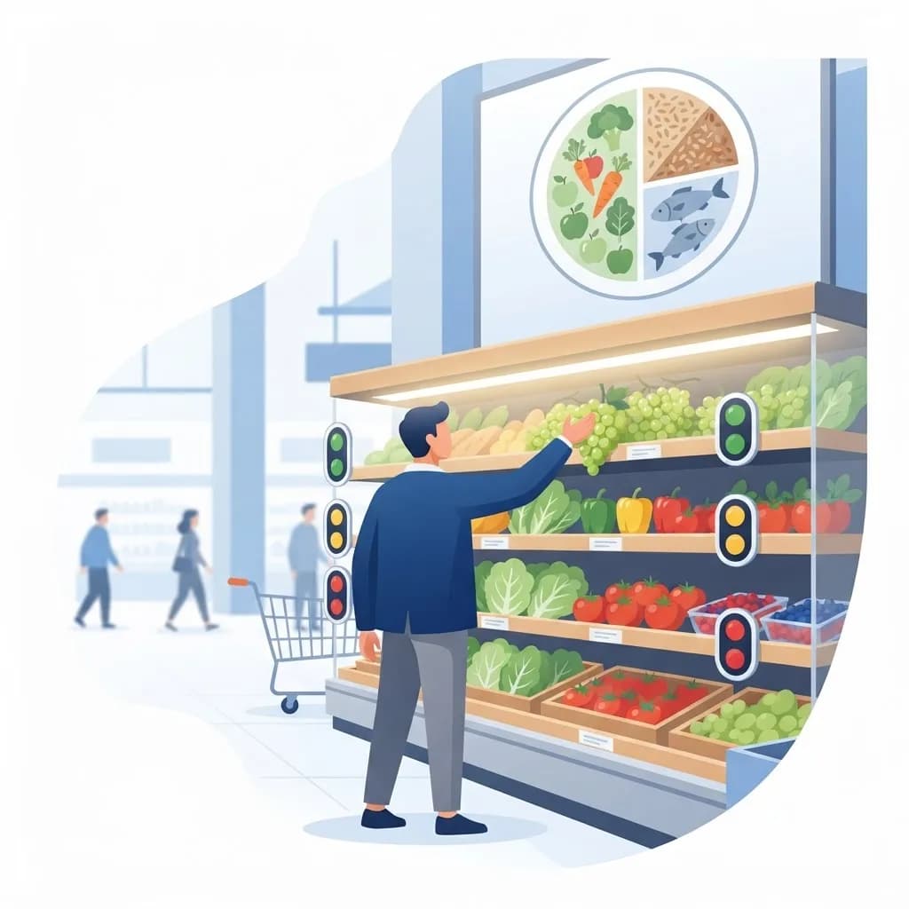
Most people do not read nutrition panels in the aisle. They scan, decide, and move on in seconds. That is exactly why a visual reminder to help consumers make healthier food choices often outperforms detailed nutrition education.
A traffic-light label, a divided plate diagram, or a simple green leaf icon does something a paragraph cannot: it lands before the decision is made.
This article explains what these visual cues are, why behavioral science says they work, and how organizations design and deploy them effectively.
What Is a Visual Reminder for Healthier Food Choices?
A visual reminder is a simple graphic cue — an icon, color code, symbol, or diagram — placed at the moment of decision to nudge a person toward a more nutritious option. In public health language these are often called front-of-pack labels, shelf tags, or point-of-decision prompts.
Familiar examples include the USDA MyPlate diagram, the UK traffic-light label, Nutri-Score's A-to-E scale, Chile's black warning octagons, and simple star ratings on supermarket shelves.
The defining feature is speed of comprehension. If a shopper cannot interpret the cue in under two seconds without prior training, it is not functioning as a visual reminder.
Who Uses Visual Food Reminders?
Adoption spans government, retail, and workplace settings.
- Public health agencies running national nutrition campaigns
- Supermarkets and grocery chains using shelf-edge rating tags
- Food manufacturers adding front-of-pack labels to packaging
- Schools, hospitals, and workplace cafeterias guiding daily meal choices
- Restaurants and delivery apps highlighting lighter menu options
Key Features of Effective Visual Reminders
Instant Interpretability
Color, shape, and size carry meaning faster than numbers. Red, amber, and green need no explanation, which is why traffic-light systems consistently outperform gram-based panels in comprehension studies.
Placement at the Decision Point
A reminder on a website nobody visits changes nothing. Effectiveness depends on location — front of pack, shelf edge, menu board, vending machine, or cafeteria serving line.
Consistency Across Products
A cue only becomes a habit when it appears everywhere in the same form. This is why national schemes standardize design tightly, and why brands rolling out their own systems invest in careful brand mark and icon design that stays legible at very small sizes.
Positive Framing Over Shaming
Highlighting better options tends to sustain behavior change better than warning-only approaches in voluntary settings, though mandatory warning labels have shown strong results in reducing purchases of high-sugar products.
How to Get Started With Visual Food Cues
Whether you run a cafeteria or a product line, the process is similar.
- Define what "healthier" means using an established nutrient profiling model, not intuition.
- Choose the cue type — rating scale, traffic light, single positive icon, or plate diagram.
- Design for the smallest size and worst lighting it will ever appear in.
- Test comprehension with real shoppers, including low-literacy participants.
- Pilot in a limited location and measure baseline versus post-launch sales.
- Roll out consistently across every relevant touchpoint at once.
- Pair the visual with a short explanation available nearby or online.
- Review outcomes quarterly and refine the criteria or design.
Benefits of Visual Reminders
The evidence base for these cues has grown substantially.
- Increases selection of fruits, vegetables, and lower-sodium items measurably
- Works across literacy and language barriers where text labels fail
- Costs far less than education campaigns or product reformulation mandates
- Pressures manufacturers to improve recipes to earn better ratings
- Speeds up decisions, which retailers and cafeterias both value
Potential Challenges
These systems are not automatically successful.
- Competing schemes confuse shoppers when several appear on one shelf
- Industry-designed labels can be accused of downplaying negatives
- Effects fade over time as people stop noticing familiar cues
- Simplification can mislead — a single score hides important nuance about portions
Best Practices and Tips
Design details determine whether a reminder actually gets seen.
- Use no more than three to five levels; more granularity reduces comprehension
- Maintain strong contrast and avoid relying on color alone for accessibility
- Keep the same symbol across print, shelf, digital, and app surfaces
- Reinforce the cue through campaign content produced with coordinated digital marketing support so recognition builds outside the store too
- Publish your criteria openly to maintain credibility and trust
Real-World Example
A hospital cafeteria wants staff to eat better without removing any options. It applies a three-color dot to every item: green for choose often, amber for occasionally, red for rarely. Criteria are based on saturated fat, sodium, and added sugar per serving, and the criteria sheet is posted on the wall.
Green items also get slightly better shelf position and a small price incentive. Over six months, green item sales rise 21 percent while total revenue holds steady. Nobody was told what to eat — the visual reminder simply made the healthier choice the easier one to spot.
Why It Matters
Diet-related disease is one of the largest preventable health burdens worldwide, and most food decisions are made quickly, under time pressure, with limited attention. Interventions that respect how people actually shop tend to outperform those that assume careful analysis.
A visual reminder to help consumers make healthier food choices is one of the few nutrition tools that scales cheaply, works across languages, and changes behavior at the exact moment it matters. That combination is rare in public health.
Frequently Asked Questions
What is an example of a visual reminder for healthier eating?
MyPlate is the best-known example in the US, showing recommended proportions of fruits, vegetables, grains, and protein. Traffic-light labels and Nutri-Score ratings are widely used elsewhere.
Do front-of-pack labels actually change what people buy?
Yes. Multiple studies and national rollouts show measurable shifts toward better-rated products, with warning-style labels producing the largest reductions in high-sugar and high-sodium purchases.
Are visual reminders better than nutrition facts panels?
They serve different purposes. Panels provide detail for those who want it; visual cues support fast decisions. The two work best together rather than as substitutes.
How do I choose criteria for rating foods?
Use an established nutrient profiling model such as those from a national health authority or the WHO. Publishing your criteria openly protects credibility and prevents accusations of marketing bias.
Conclusion
A visual reminder to help consumers make healthier food choices works because it is fast, wordless, and placed exactly where the decision happens. Define clear criteria, design for two-second comprehension, deploy consistently, and measure the results.
If you are building a nutrition labeling program or campaign, our social media and banner design services can help your visual system stay consistent everywhere it appears.
Enjoyed this article? Share it with others!